A worked example
The first transition site was mine
Why this file exists
Overview
Nearly 19 years in the fire service — firefighter, rescue diver, training officer — and still serving. In 2026 I opened a one-project-at-a-time Webflow studio for founders in transition, built alongside the shift schedule. My first client was the hardest kind: me. alinbloj.com had to do the job I now sell — take a business that's changing direction and turn its story into a clear, confident website. That's what I call a transition site: a website rebuilt around where the business is going, not where it's been. This is how the first one was built, including the parts I got wrong.
What the site had to solve
The challenge
Before: a new studio with no portfolio, a founder whose credibility lived entirely in a different profession, and a strategy scattered across months of notes — three different site concepts, two languages, two audiences. If someone had asked "what do you do?", the honest answer was "it depends which draft you read."
That's the exact situation my clients are in. A founder in pivot or relaunch doesn't lack a story — they have too many versions of it, and their site reflects all of them at once.
The specific problems this site had to solve:
- Zero client proof. No case studies, no testimonials, no logos. The site itself had to be Exhibit A — the craft on the page is the evidence.
- A story that could easily become a gimmick. "Firefighter becomes web designer" invites either pity or novelty. Neither wins a €4–6k project. The transition had to read as an asset — discipline, calm, process — not as the product.
- An offer that needs to disqualify. One person, one active project at a time, 6–10 weeks. The site had to turn away "cheap and fast" buyers as confidently as it attracts the right founders — openly, in the copy.
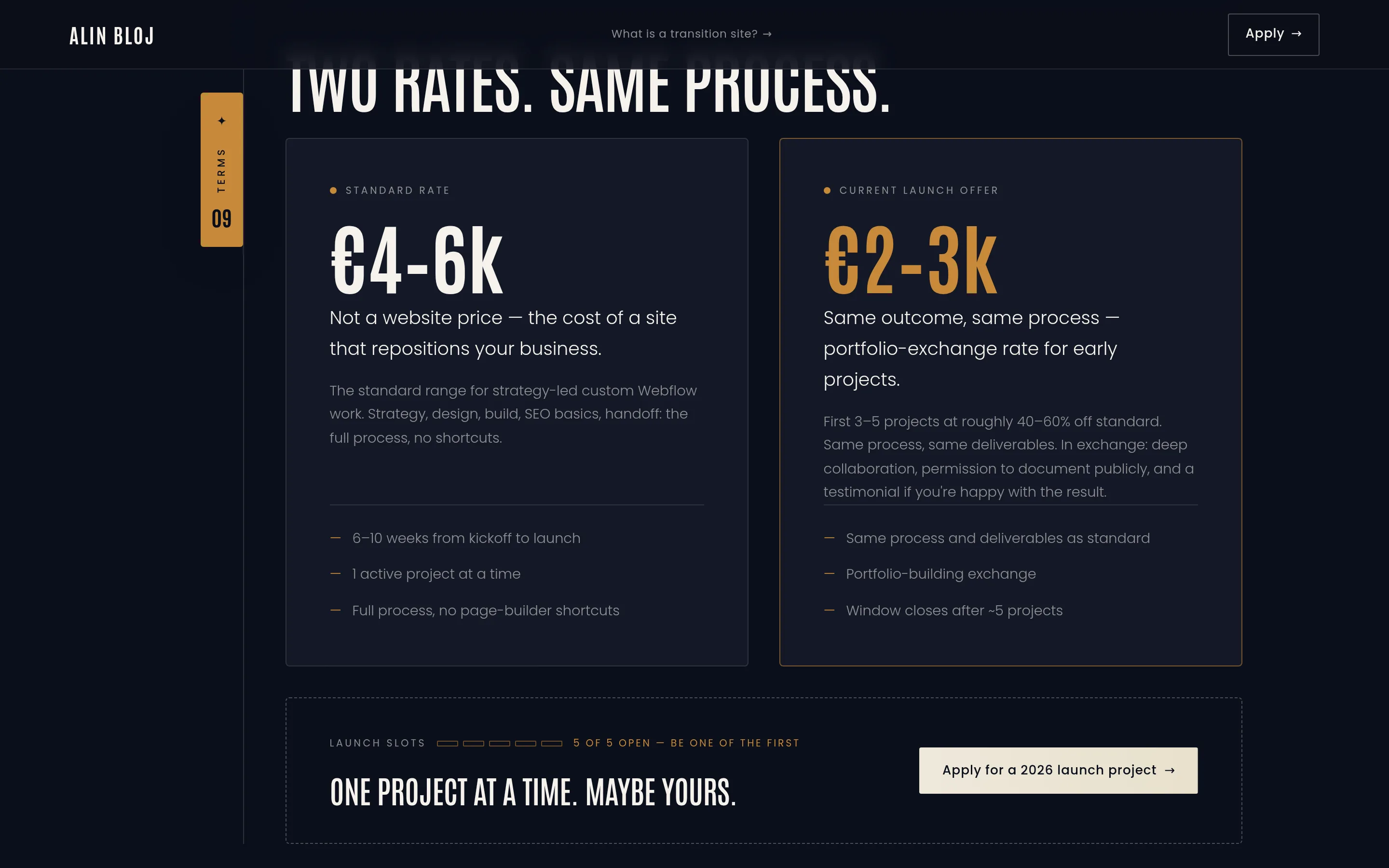
- Honest pricing at day zero. First 3–5 projects at €2–3k launch pricing, anchored against the real €4–6k range — without the discount reading as "not worth more."
Five decisions
The approach
I ran myself through the same process I run clients through: strategy first, design second, build last. The decisions are the story.
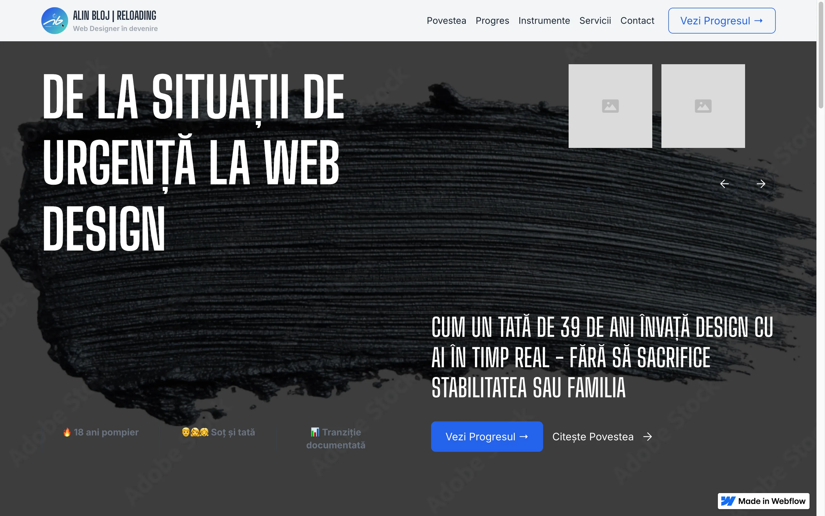
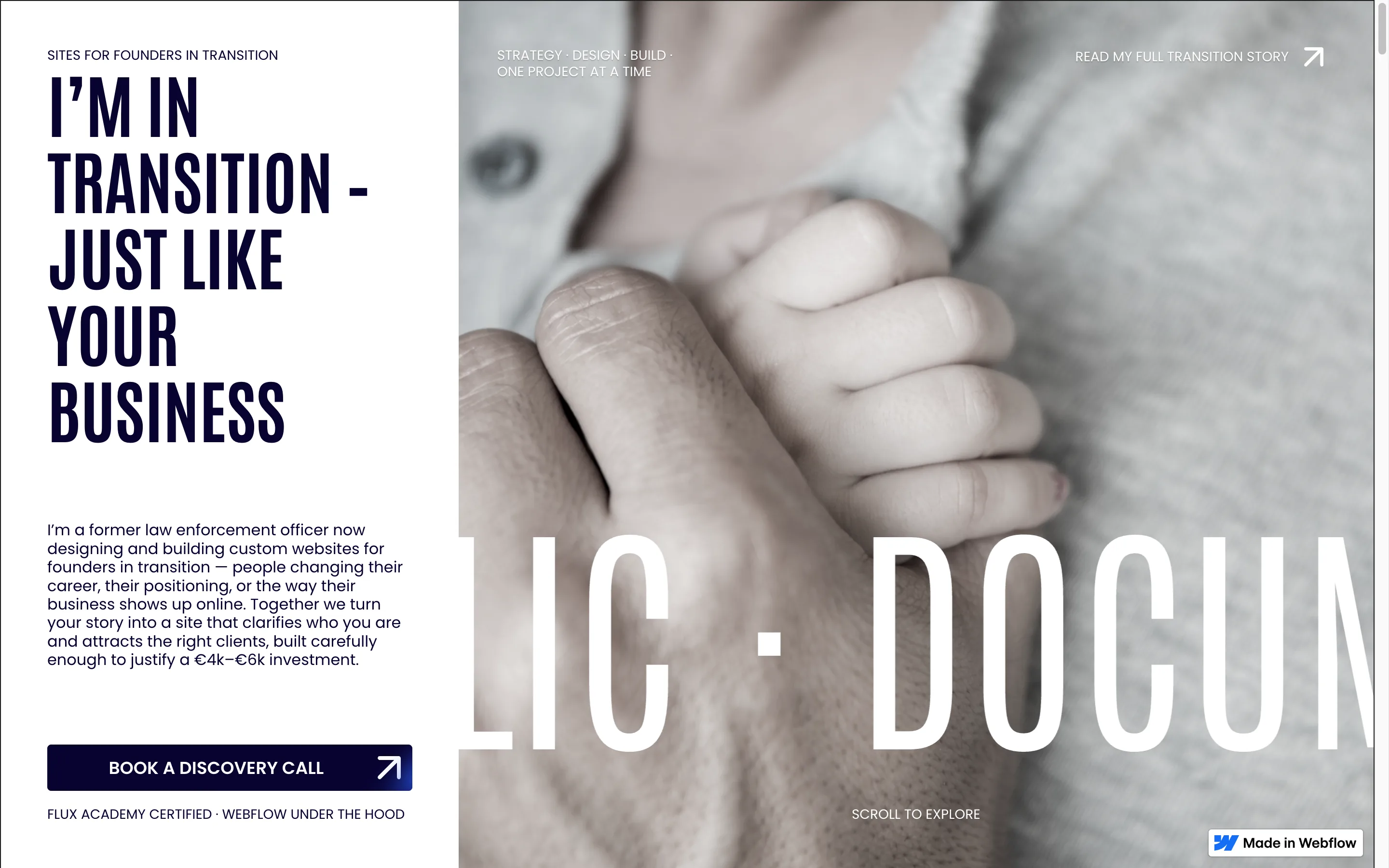
1. Positioning before pixels. Months of strategy work produced one sentence: I help founders in transition turn their story into a clear, confident website that attracts the right clients — not just more clicks. Getting there meant killing directions I'd already invested in: a Romanian-first site aimed at the Romanian market — where I'd have been competing on fast and cheap; a six-page structure; a poetic charcoal-to-pencil visual metaphor. All defensible. None honest about who the studio actually serves. The discipline wasn't generating ideas — it was writing down what the site would not be, so nothing could creep back in.
2. One page, disqualification built in. The site became a single long homepage: story → fit → process → scope → pricing → apply. A "Who I'm a good fit for" section says plainly who shouldn't hire me. Pricing is public, with the launch offer anchored against the standard range. The bet: a founder investing €4–6k rewards honesty they can verify before the first call.
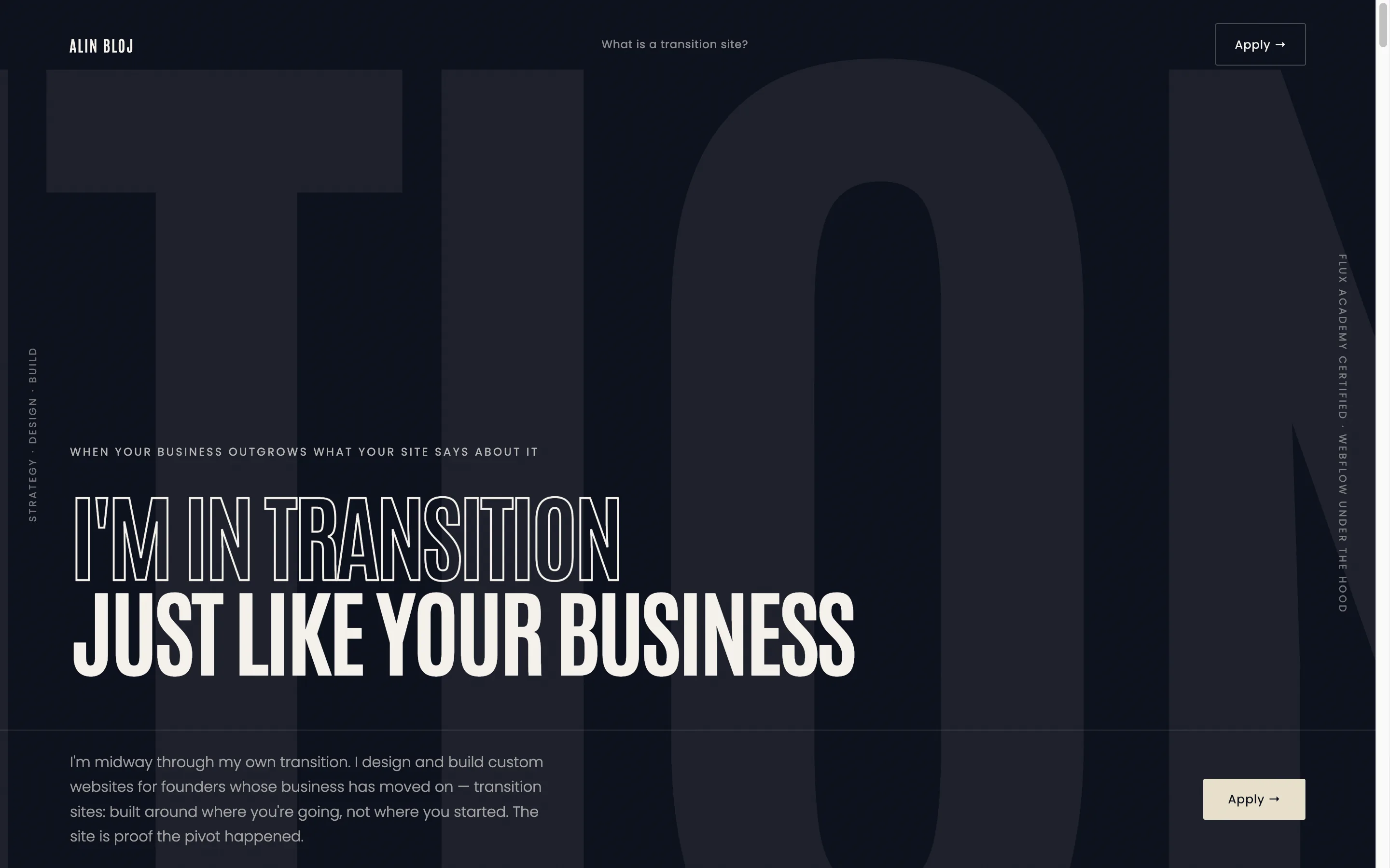
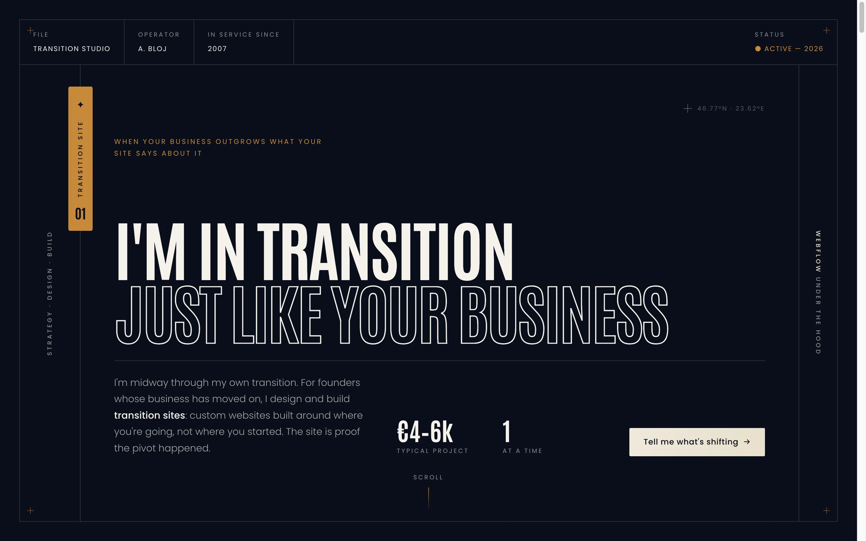
3. A design system with a reason. The first visual direction — cinematic minimalist, Antonio condensed headings, navy and cream, one warm amber — was right in register but generic in structure. The breakthrough was reorganising it as a Field Dossier: an operational case file. Numbered section tabs (01 → 12), a metadata header (FILE / OPERATOR / IN SERVICE SINCE 2007 / STATUS ● ACTIVE), amber as wayfinding rather than decoration. Almost two decades of service records became the site's information architecture — the backstory bound into the structure instead of told as a sob story. A second, prettier direction (editorial serif, crimson) was fully prototyped and rejected: it looked good and felt like someone else.
4. Restraint as a strategic choice. No stock imagery, no 3D, no gradient spectacle. The register founders in transition respond to is calm and confident — a site that has nothing to prove is the proof. Every interaction that did make the cut is functional: a chapter accordion for the transition story, a five-question fit diagnostic, a live clock showing my actual timezone. Motion reveals information; it doesn't perform. That rule eventually cut the site's own showpiece: pricing launched as a pinned horizontal-scroll scene, until a conversion audit showed the sweep was hiding the Apply button. It's a plain two-card grid now. The showpiece lost to the button.
5. The build was a strategy decision too. I direct; AI executes. Every positioning, copy, and design decision on this site is mine — AI agents working to my briefs produced the code and the drafts, and nothing shipped until I'd read it, cut it or rewritten it, and verified it live in the browser. For a studio's own site at day zero, that's the right trade: fast to iterate, nothing to maintain, and the hours and money stay where clients actually feel them — on the work. Client projects are the opposite trade, deliberately: they ship on Webflow, where the founder gets the Editor, native Forms, and a custom website they can run without me in the loop. My site serves my process. A client's site has to outlive it.
Live at alinbloj.com
The solution
A single-page transition site of twelve numbered sections, live at alinbloj.com:
- Hero — two-tone Antonio headline: "I'M IN TRANSITION" filled, "JUST LIKE YOUR BUSINESS" outlined. The dossier metadata bar and numbered file-tab establish the system in the first viewport.
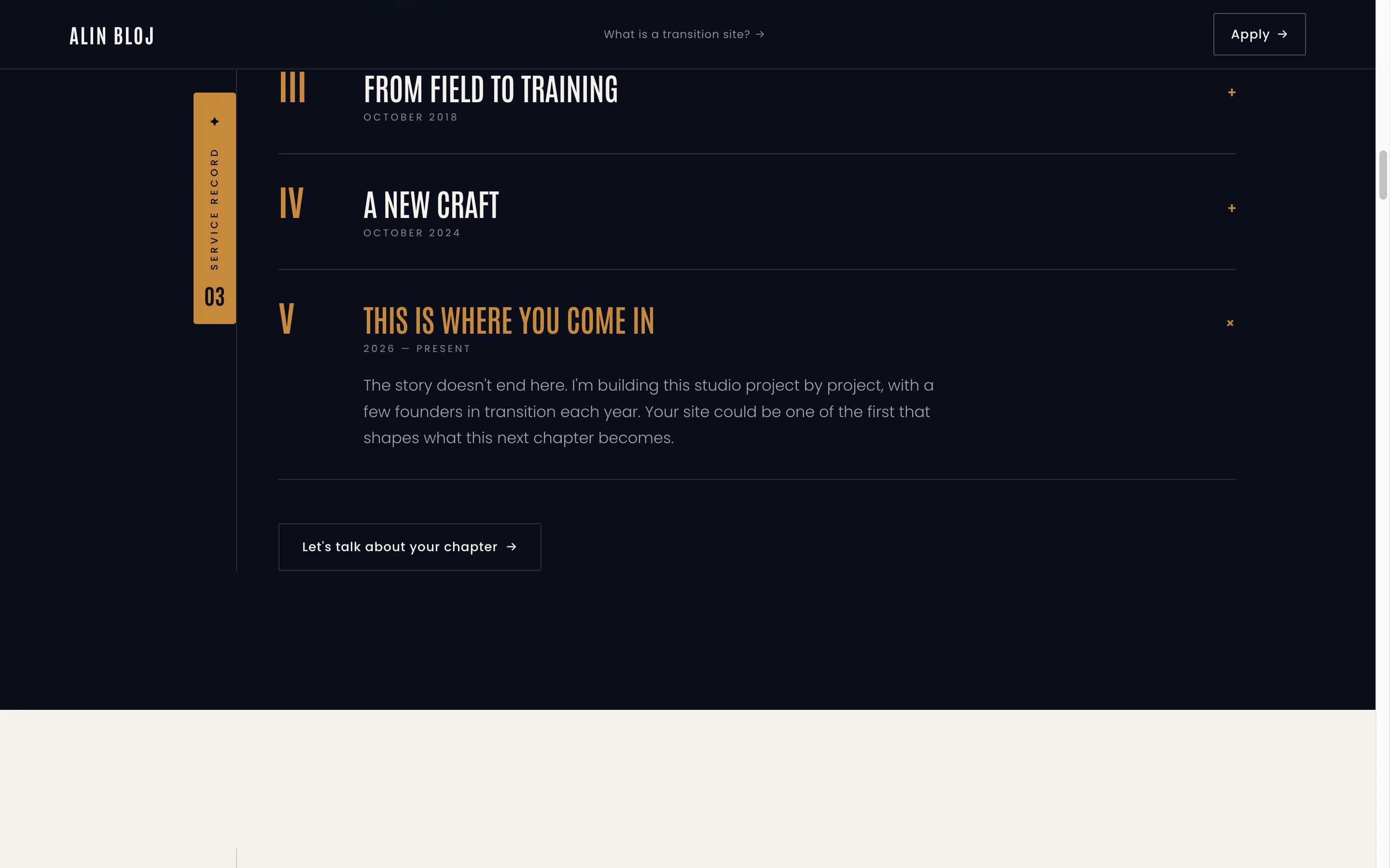
- Story as accordion, not autobiography — five chapters from first uniform (2007) to "this is where you come in" (2026). Collapsed by default; the visitor chooses how deep to go.
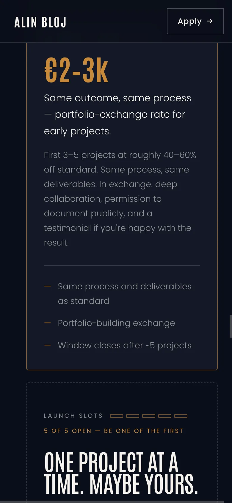
- Open pricing with honest scarcity — both rates public, side by side, and the Apply band beneath them carries a slot meter that reads "5 of 5 open — be one of the first." Zero slots are taken and the site says so. A fabricated "3 of 5 filled" would have broken the honest-qualification promise on the first discovery call.
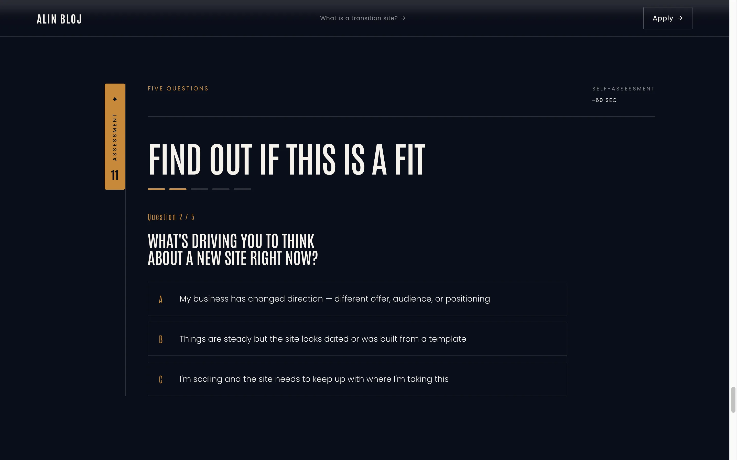
- A fit diagnostic — five questions that tell borderline visitors, in my voice, whether we should talk. Disqualification as a feature.
- Craft in the details — grain texture, ghost chapter numerals, marquee ticker, oversized ton-sur-ton footer wordmark, prefers-reduced-motion fallbacks on every animation, and a 404 page written in the same voice.
What can be verified today
Results
Launched July 6, 2026. Conversion data doesn't exist yet — results tracking begins with the first outreach cycle, and this page will be updated when real numbers exist. What can be verified today:
- Lighthouse accessibility score: 100. Full keyboard support, reduced-motion fallbacks throughout, no contrast failures.
- No dependencies. All motion is vanilla JavaScript and CSS — no animation libraries, no trackers, self-hosted fonts. Nothing to break, nothing phoning home.
- The process caught its own bugs. A post-launch audit found that on mobile, the pricing cards — including the launch offer — sat off-canvas and invisible. Root-caused, briefed, fixed, and browser-verified live within a day. The same audit-and-fix loop every client site gets.
- The design holds up under its own review. The pre-launch craft check asked the hardest question directly: is this restrained, or just basic? Verdict: deliberately restrained and genuinely crafted — and the restraint is the strategy.
One honest before/after, since there are no metrics yet:
Before: three site concepts, two languages, two audiences — and no answer to "what do you do?" that survived a follow-up question.
After: one page, one ICP, one sentence that doesn't flinch — and a site that says "no" to the wrong projects before I have to.
The client was me
Testimonial
None — the client was me, and quoting myself would be exactly the kind of manufactured proof this site refuses to use. The first client testimonial will appear here when it's real.
What it runs on
Tech stack
- Design: no Figma round-trip for this project — the design was developed as a high-fidelity working prototype and judged where visitors would judge it: in the browser, at real size, on every pass.
- Build: static HTML/CSS/vanilla JS (Astro) on Netlify, written by AI agents to my briefs — the reasoning is decision 5 above. No page builder, no subscriptions, nothing to maintain.
- Client stack: client projects ship as custom Webflow websites — the Editor, native Forms, a site the founder maintains without me in the loop.
- Typography: Antonio (condensed) + Poppins, self-hosted
- Forms: Netlify Forms
- Motion: vanilla JS + CSS only — IntersectionObserver reveals, accordion, diagnostic, live clock. No GSAP, no Lenis, no Splide.
- SEO/GEO: full meta + Open Graph + FAQPage JSON-LD
One project at a time
If this sounds familiar
Your business moved on. Your site didn't. That's the exact problem a transition site exists to solve — and you've just read how I solve it, including how I catch my own mistakes. The first launch slots are €2–3k instead of €4–6k, in exchange for deep collaboration and a public case study as honest as this one. The slot meter on the pricing page tells the truth: if it says open, it's open.